Overview
Micro Beauty Mark is a Southern California based beauty and cosmetics brand that focuses on microblading, microshading, and permanent makeup.
Objective
The objective of the project is to redesign the Micro Beauty Mark identity system utilizing a sophisticated, classy, and modern visual language. Develop an identity that is impactful, yet elegant and simple enough to work consistently and effectively with any application including: website, stationery, storefront, interior design, and other brand materials.
Role
My role in this project was to consult, art direct, and design the Micro Beauty Mark identity system.
Brand Style & Vibe
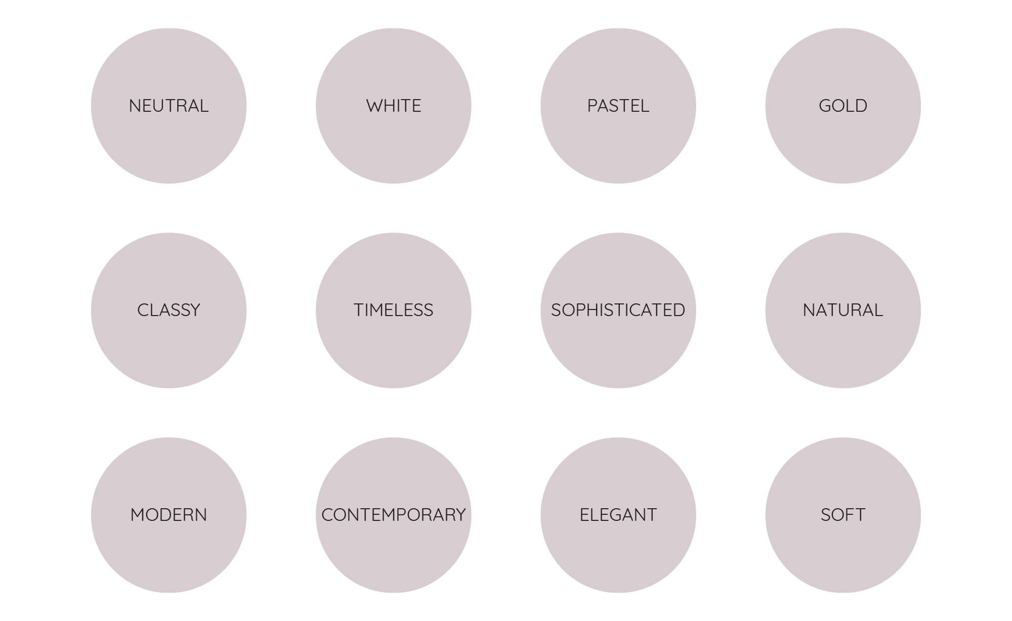
During the discovery phase of the process, the client and I discuss and develop a list of words that describe the vision of the brand. As the great Marty Neumeier says, branding is not just the logo or an identity of a company, but a gut feeling an individual has about the company. What people feel and think when they see the company communicate through their products or services. In this phase, we try to develop what the visual perception will be for the client's audience. We start this by writing down as many adjectives as possible and narrow down to a select few that we think is a good foundation to proceed to the next step, developing a stylescape.

Stylescape
A stylescape is the result of the research we've developed in the discovery phase of the project. Here we curate a visual language and the direction of where we see the brand going by utilizing colors, fonts, logos, and imagery.
We end up using Quicksand as the typeface and the palette below for the brand colors. Quicksand was chosen because of its rounded and soft letterforms to create an organic, natural, and almost hand drawn look and feel. The colors were chosen for their neutral tones to support the style and vibe we decided upon during the discovery phase of the process.

Logomark & lockup
The final logomark is a combination of offset lines to create the letter "M" and an ink droplet in the middle to call to the art of permanent make up. The linework of the mark and the gradients from the colors add that elegance and sophistication we were hoping to achieve during discovery.

Contextual Application


