
50%
Fewer steps
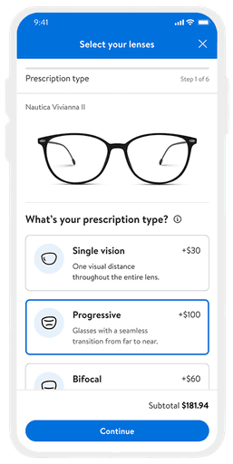
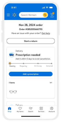
70% of users were dropping off during the lengthy Vision Center e-commerce shopping flow, leading to an incomplete conversion. Users were dropping off when they were prompted to add a prescription for the order.
1.
Decrease drop-off in the shopping flow.
2.
Increase conversion rate from the product page.
3.
Build a solution that scales for our northstar.
Lead design strategy and collaborate with product, business, engineering, and other cross-functional teams to build a solution that solves our business and user challenges.
UX, Data Analytics, Content, Research, Product, Business, Engineering, Legal, Accessibility.


Business challenge
Conversion was significantly lower than industry standard due to 70% of users dropping off during the prescription intake portion of the E2E flow.
User challenge
Our users found it too time consuming to complete a Vision Center purchase. They were also forced to add a prescription even if they may not have been ready to.
Before (28 screens)

After (10 screens)


Process
I followed a collaborative and iterative process to identify and solve key user and business problems. Starting with research and data analysis, I pinpointed pain points in the current experience. I then conducted competitive and internal audits to further define and prioritize issues. From there, I ideated and designed solutions, collaborating closely with product, business, and engineering partners to ensure alignment. After presenting to stakeholders and refining my work based on feedback, I finalized the designs for engineering handoff.
Challenges
My biggest challenges was identifying the right point in the flow to introduce the feature and choosing the appropriate UX patterns. A suboptimal implementation risked customer drop-off, leading to alignment issues across the 4ITB and senior leadership teams.
Solution
After many reviews and working sessions, I accepted that every option involved trade-offs. I chose the best path forward for launch, with plans to monitor and adjust as needed after the MVP.
Key Takeaways
Successes
This feature gives users more flexibility around when to add their prescription and streamlines the pre-transaction flow by cutting at least 15 screens which reduces friction, speeds up orders, and increases conversion. It’s also built to scale for the future.
Opportunities
One of our biggest challenges was alignment between the 4ITB and senior leadership. If we were able to conduct more user testing to gather data, it may have helped guide friction points within the team and support certain solutions.
Want to hear the full story?
Get in touch for a complete case study presentation.
Contact
More Work
Web
iOS
Android
A smoother flow from product page to purchase
Reducing friction for customers in the online Vision e-commerce shopping experience
View more
Web
Enhancing product discovery & decision-making for Vans customers
Redesigned shopping experience to improve add to cart and conversion rates
View more

Web
Redesigned navigation experience to improve speed and efficiency during product search
View more