
+3.2%
Add to cart rate
+0.8%
Conversion rate
1.
Fix usability issues to improve shopping experience.
2.
Optimize features to increase KPIs.
3.
Refresh visual design for a modern, branded feel.
UX, Data Analytics, Research, Business, Engineering, Ecommerce, Marketing.
Focused on information hierarchy, clarity, and accessibility.


Focused on guiding user to checkout with minimal friction, information hierarchy, and visual impact.


Business challenge
User challenge

Process
I followed a user-centered design process to identify key pain points and validate assumptions through research. From there, I prioritized problems, ideated solutions, and tested prototypes with users. Based on feedback, I iterated through multiple rounds before presenting final recommendations to stakeholders and handing off to development.
User tests
We had two rounds of qualitative testing to discover user feedback and preferences. Here are some things our users had to say.
PLP
“More clean, organized, and easy to read.”
“Easier to navigate, not as much information overload.”
“[Filters] look cleaner and less dingy than the current design.”
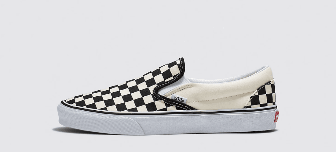
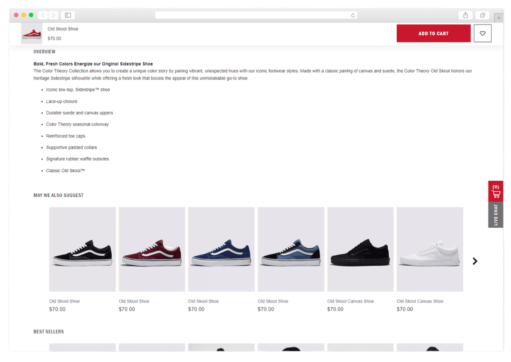
PDP
“The thumbnails feel more engaging and easier to navigate.”
“[Sticky add to cart] is a super helpful feature.”
“Love the size tiles letting you see what’s available at a glance.”
Key Takeaways
Successes
Opportunities
Want to hear the full story?
Get in touch for a complete case study presentation.
Contact
More Work

Web
iOS
Android
A smoother flow from product page to purchase
Reducing friction for customers in the online Vision e-commerce shopping experience
View more
Web
Enhancing product discovery & decision-making for Vans customers
Redesigned shopping experience to improve add to cart and conversion rates
View more
Web
Redesigned navigation experience to improve speed and efficiency during product search
View more