VANS
NAVIGATION
Design Thinking / UX / UI
Exploration redesigned.
The vans.com navigation is the primary vehicle for our users to get to their intended destination. With the world of shopping convention changing, we started to rethink how our users navigate the site.

Project Overview
The vans.com navigation needed a redesign to reflect a new taxonomy that was being implemented. The new navigation changed to lead with what users are shopping for (shoes, clothing, accessories, etc) from who users are shopping for (mens, womens, kids). Most of our users are shopping for shoes and a majority of our styles are gender neutral, leading the team to explore updating the taxonomy. We wanted to dig deep to explore if this approach ultimately makes sense with our brand and audience. We focused largely on mobile as it was the more complicated experience.
vans.com
My Role
My role was to oversee the UX/UI of the redesign and act as the bridge between the e-comm, marketing, UX, and development teams. I designed the initial and subsequent iterations of the UI, worked with UX teams who conducted and analyzed research and user testing. I iterated designs based on research and user feedback, and presented to stakeholders.
Goals
• Validate taxonomy switch from leading with who users are shopping for in gendered categories (mens, womens, kids) to a genderless approach leading with what users are shopping for (shoes, clothing, accessories, etc).
• Decrease the time it takes for a user to select a specific category. Make navigating between categories easier and quicker.
• Update visual design to match the redesigned PLP and PDP.
OLD Designs
page by page Navigation
In the old design, we used a page by page navigation for the menu. During research, we found that users spent a lot of time finding the category they're looking for. If users wanted to go back to a previous category, they had to tap the back button to go back one or several pages to find their category.
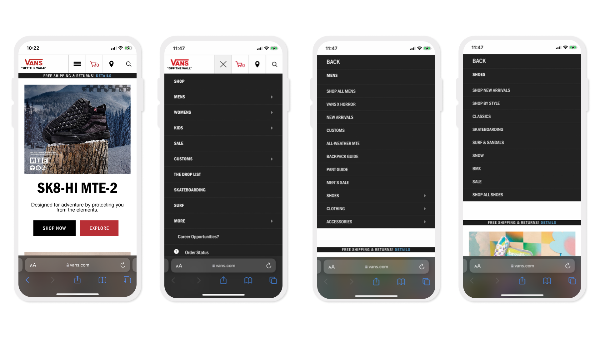
Final Designs
Accordion Navigation
In the new design, we used an accordion style navigation for the menu. With this design, we found that users spent significantly less time getting to the category they're looking for. If users wanted to go back to a different category, they simply had to scroll up or collapse the section they're in. During testing, we found that users were able to find the category they were looking for quickly and accurately compared to before.


Impact
User Feedback
These are some of the things our users had to say after our final round of testing.
“So well designed. Very easy to use. Many websites have too many details. Would love to shop in it.”
“Everything looked really good. The navigation and the menu is really easy to use and it felt really natural.”
Process
Iterative Design Framework
Our design process allowed us to research and validate the problems we wanted to solve. We cycled through rounds of ideation, prototype, and testing phases to ensure our designs resonate with our users before presenting final outcomes to key stakeholders and development. Here is an outline of what we did:
1. Competitive research and analytics data gathering.
2. Define and prioritize problems we wanted to solve.
3. Ideate/explore initial designs based on research and new features we want to add.
4. Qualitative testing with new designs to gather feedback from users.
5. Analyze test results and iterate designs accordingly.
6. Repeat testing and iterations for 1-2 rounds.
7. Present findings and recommendations to stakeholders.
8. Connect with development for handoff.to stakeholders.
8. Connect with development for handoff.
Data
Site Analytics
To start validating the taxonomy switch and order of categories, we looked at the click rate analytics. Shoes had the highest click rate, 4x - 9x higher than the second most clicked category, Clothing, followed by Accessories.
Market Research
Gender in Shopping
The argument between gender vs product first was a challenge for our research team. We looked at different shopping experiences, focusing on active lifestyle brands. We looked at REI, Mizuno, Brooks, Rawlings, and Zumiez. Gender agnostic shopping is a common pattern in sporting goods stores. As the world is changing, gender in shopping is becoming less important and it's a pattern shoppers are getting used to seeing. Vans products are largely gender neutral, especially our shoes. With all this in mind, the team felt comfortable deprioritizing gendered categories to lead with product categories in the navigation.
Test
Qualitative Testing
The initial tests tested the new look and layout of the navigation.

Key Takeaways
• Nav is clear and easy to find.
• Dropdown categories made sense to most users.
• Users were able to successfully complete task of navigating to Mens shoes and clothing.
• Users liked the ability to drill down into subcategories.
• Organization of content and design were valued by users.
Opportunities
• Explore why certain text is bold while others aren't.
• Create greater contrast between subcategories in dropdowns.
• Filter by gender after selecting category caused some confusion.
TestING
Card Sorting
We utilized a cart sorting exercise with 25 users to give us ideas and further validate the order of the new taxonomy. The card sorting results led us to explore the menu sections deeper and conduct a preference test to see how users felt about the order of the categories.

Key Takeaways
Overall we found that user preferences had a lot to do with how they shop and the order they preferred. Some users showed mental models of exploratory vs targeted shoppers. Users who described a more exploratory approach to shopping liked seeing featured items first, while users who described a more targeted approach were more likely to consider “Featured” to be unnecessary. The only placement users were strongly against was having gender at the bottom of the menu (Option B). Based on the test results, we proceeded with Option C, leading with genders and following with featured items.
Final Designs
Observations
SUCCESSES
The project is on a successful path in achieving the goals we set for ourselves. Due to the way we approached the redesign and the extensive research and testing, we were able to support key decision making in our designs. The team’s trust in our audience’s feedback allowed us to confidently implement the designs and even add to it to this day. Though not launched yet, we have enhanced the navigation with new features to make the shopping experience even easier for our users.


